

This week on the “Trash That Ad” series, I’m going to be delivering this via blog post instead of YouTube video. The reason for this is twofold:
1. You don’t have to listen to me blabber on for 30 to 40 minutes (I am much more succinct in writing).
2. You can download a PDF version of the entire episode that you can print out and study yourself PLUS being able to download and print off PDF versions of the piece of copy itself.
Hopefully, this will be a much better delivery mode for the same content.
Okay, let’s get into it!
The Piece
Download The Piece Below
TheWrongPeopleAreCleaningYourHouse
I really like this little mailer.
It just screams “this piece makes money“.
Whoever wrote it, has obviously learned a thing or two about direct response copywriting, and there are tons of good little tidbits that we can pull from this to use in our own copywriting (Even and especially online).
This particular piece came to my house via the mailbox, and is a cold mailer (meaning: I didn’t opt into any list knowingly, this is a cold piece.)
Let’s Trash That Ad
1. The First Fold
Let’s just talk about the first fold of this trifold pamphlet.
It’s a true direct response beauty.
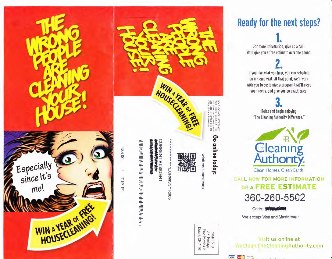
First thing I noticed when I picked this up out of the mail was the bright red background color. Set in amongst all those white envelopes and bills, this bright red glossy piece stuck out like a sore thumb.
I love that headline.
“The wrong people are cleaning your house!”
Here’s why works for me:
I have people who come and clean my house. If you have ever tried to hire someone to come into your home and clean up after you, you realize how emotional/apprehensive that process can be. You don’t know if you’re getting a good deal necessarily, it can be invasive to have somebody into your home, and if you’re like me and grew up on the wrong side of the tracks then you have certain stigmas to deal with when people come into your home.
This particular headline plays right into all of that emotional baggage.
It “verbalizes” the exact thought I have every Thursday morning after the cleaning people leave.
It won’t work for everybody, but it works for me – and it’s people like me who this piece is trying to attract.
I consider this a swipeable headline (it’s in my file now).
Though I’m not a big fan of the font choice of the headline, the yellow coloring immediately draws your eyes. The crooked typesetting is a nice pattern interrupt as well.
The image of the terrified woman induces a heightened response. Even if it is drawn in comic book style, you have one of two reactions:
1. Humor
2. Fear/reactionary fear
Either way, emotions are being played upon the second you lay your eyes on this particular piece.
What I don’t like is the line in the speech bubble “especially since it’s me!”. It’s confusing.
And confusion = reduced conversion rates.
I would’ve changed it to something like “oh no!” Or something simple like that.
Perhaps the greatest thing about this entire piece (at least the outer part of it) is the claim:
“Win a year of free housecleaning!”
He see it twice on the outside of the piece. Once on the front and once on the back.
Housecleaning is not cheap. I would love to win a free year of housecleaning.
And by combining that particularly strong claim with the bright yellow arrow the copywriter for this piece has “forced” me to the back of the piece (when it’s closed).
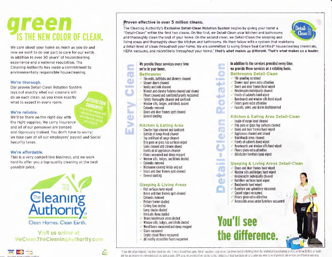
2. “The back” Following the claim + big yellow arrow ends you up right smack in the most important part of this entire direct mail piece.
The QR code in combination with the website address “winfreeceleans.com” is what makes this piece so great.
Without even having to open it up, I’ve been given enough information to entice me enter a sweepstakes to win a year free housecleaning.
In other words:
Without even having to open this thing up I’m about to opt in to their email list.
This is brilliant.
In a lot of ways, it’s like a pop-up on a sales page.
Even if I don’t open this up, even if I don’t buy what they’re selling, they can get me onto their email list. They can collect more information from me, make better decisions about who I am, and market better to me as a consumer.
Study this my friends. It can make you a lot of money.
3. “Ready for the next steps?”
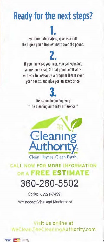 This particular piece is just crawling with incredible examples of calls to action.
Whoever wrote this, completely and fully understood that if you are going to spend money to advertise you BETTER get your calls to action in order.
Getting people to DO something is the whole point of advertising.
And this writer pulled it off.
In this particular portion of the piece we see an easy three-step call to action.
Any time you can do your call to action as a series of steps where each step is a sentence or two long, you’re going to increase your response rate. Nearly 100% of the time.
But one of the BEST tricks about this particular three-step call to action can be found in the third step.
“Relax and begin enjoying…”
In copywriting, you want to help the prospect “future cast” the results.
In other words, you want to put in their mind the vision of their life AFTER they have purchased your service/product.
One of the easiest, and quickest ways to make sure that your reader is “future casting” is to include as one of the steps of your call to action the result of your product or service.
In this particular instance, the end result of hiring this company is being able to “relax and begin enjoying…”.
And that’s why it’s step number three in the call to action.
Next time you’re writing out your steps for a call to action, include the end result.
And of course, the rest of this particular portion is spot on.
Clear & clean logo with the clear &clean mission statement:
“Clean homes. Clean earth.”
Simple. Obvious. Memorable.
Then you have the free estimate offer (which is always a good idea), followed by the phone number in large print with the access code to claim your free estimate, payment methods and another website to visit.
My only concern with this particular page is actually the website itself.
Here’s why:
It’s a complex URL.
It has too many periods AND it’s not the same URL that gets you the free year of housecleaning.
Certainly not a huge issue, but it would be something that I would want to split test if I were running this campaign. Especially since so many people make decisions like this online, I would want to make sure that my piece is getting people to the site. And people are so fickle that typing in complicated URLs can and will decrease conversion.
4. “Green is the new color of clean”
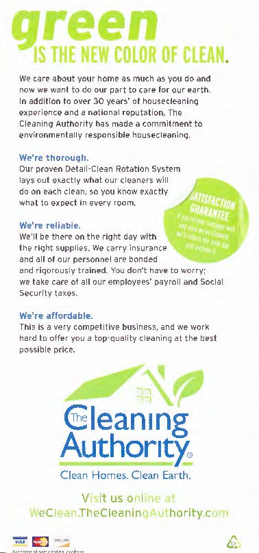 This is pretty much your standard “web copy” type of verbage.
To be honest, if I were to rewrite this I would reframe every time the word “we” is used and turn it into a benefit that the reader receives.
Instead of “we’re reliable”, I would try something like this:
“You can count on us to be on time, every time, ready to work.”
Or something like that.
My critique of this page is that he uses the word “we” a lot which is really, really boring to read.
However, the satisfaction guaranteed sticker is a great idea.
The text under the satisfaction guarantee itself is a little small, but having it stick out like this is brilliant. I would even be okay with it being bigger, and sticking out even more.
It’s a strong guarantee, and one that isn’t offered by a lot of cleaning companies.
5. Features page
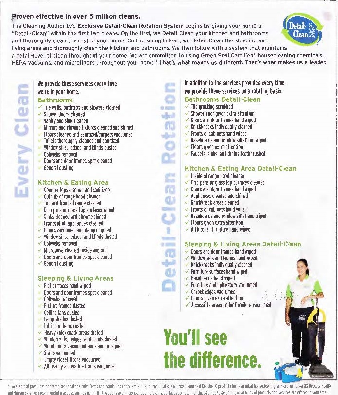 “Proven effective in over 5 million cleans”
That’s just strong, good copywriting right there.
I really, really love this product breakdown section.
As a consumer of cleaning services, knowing exactly what I get when I pay money for a cleaner is incredibly helpful.
More specifically, with this particular piece what stood out to me is this idea of the rotating services.
And this is where my critique comes in a little bit.
While I’m happy to see all of the features listed, what I don’t see is the benefit of having rotating deep cleans being a regular part of your cleaning services.
What I would have done instead of having the service title running vertically on the left-hand side of the features, is I would have created a larger headline that went something like this:
“Every clean you get X, Y, and Z PLUS every X weeks you get the detail clean service which is X, Y, and Z.”
And THEN broke down all of the features below that.
I think this is just one of those instances where the designer and the copywriter had to make some choices, and they chose to let the design override the copywriting effectiveness in this particular case. I don’t know too many people who can read vertical writing from top to bottom, but maybe that’s just me.
And lastly, you see the little image on the bottom right-hand corner of the maid/model which is always a nice touch. (people respond to images of other people)
Conclusion
Overall, I think this is an incredibly effective piece of direct response mail.
A lot of good stuff to swipe, particularly:
1. The color choice on the outside
2. The outer headline
3. The strong claim in combination with the yellow arrow to guide the reader to opt in before the pamphlet is even open
4. The three-step call to action with “future casting”
I hope that you enjoyed this particular episode of “trash that ad”.
You can download the PDF of this particular piece of mail below along with a PDF version of this post that you can take home, print out, and read over and over again.
The Piece
TheWrongPeopleAreCleaningYourHouse
This Post
Please let me know if you prefer this method (blog post) versus the YouTube video/audio for future episodes of the “trash that ad” series.
To your success,
Mike